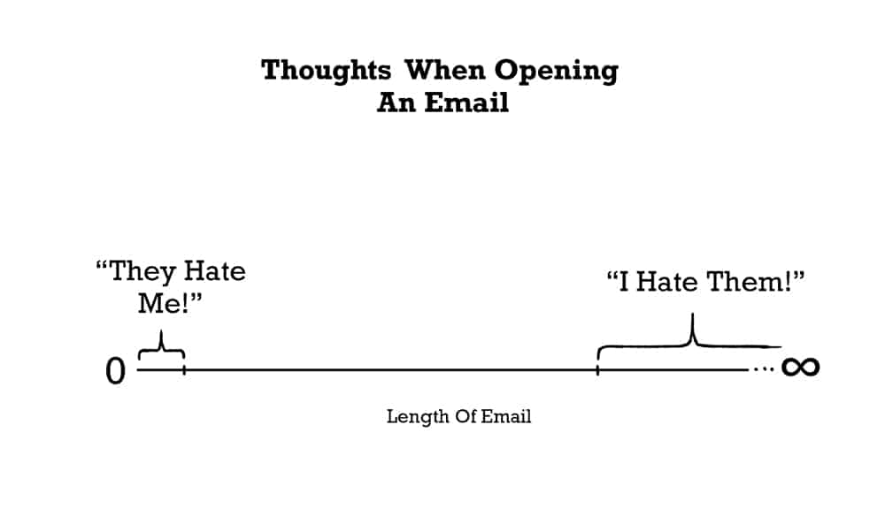
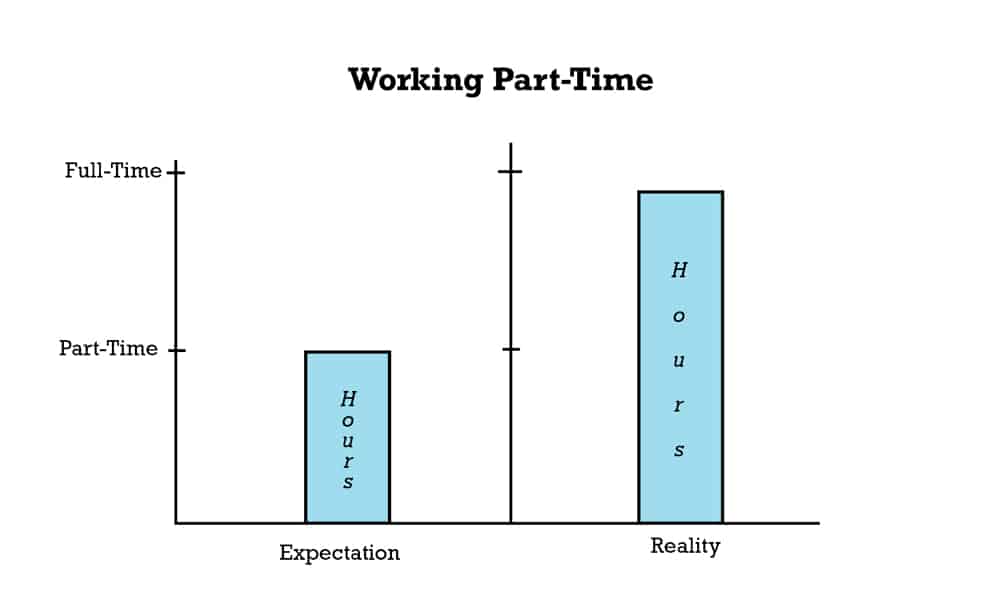
The truth may be hard to swallow, but charts and plots can make it easier. There’s something about a colorful pie chart or data points mapped out neatly on a line graph that makes things seem that much more plausible. It’s easier to digest numbers in pie chart form—incidentally (or perhaps not so incidentally) the Toggl time tracker has a Reports feature where you can see your hours worked visualized as a multicolored donut chart.
And generally, it’s reasonable to assume that people like infographics. “Infographics about work” certainly has a much more appealing ring than “the latest academic research about work,” or “white papers about work.” It’s like picture books for adults.
The seductive and persuasive quality of infographics is not news. There’s even a book on it, albeit one that examines this influence critically: Yes, infographics are powerful, but this power can be used for good or for bad. Responsible deployment of infographics is all the more important when the infographics are about work, where there is a lot to disagree about, and a lot of people to disagree with.
In this particular instance, however, War and Peas harnesses the power of infographics for good to present some indisputably true facts about work for Toggl.
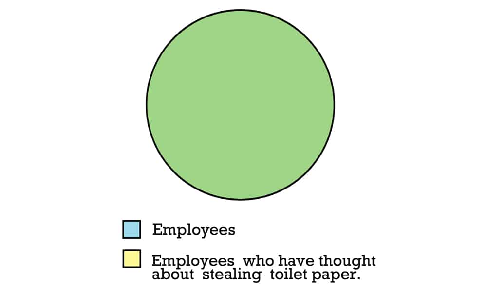
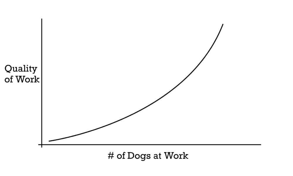
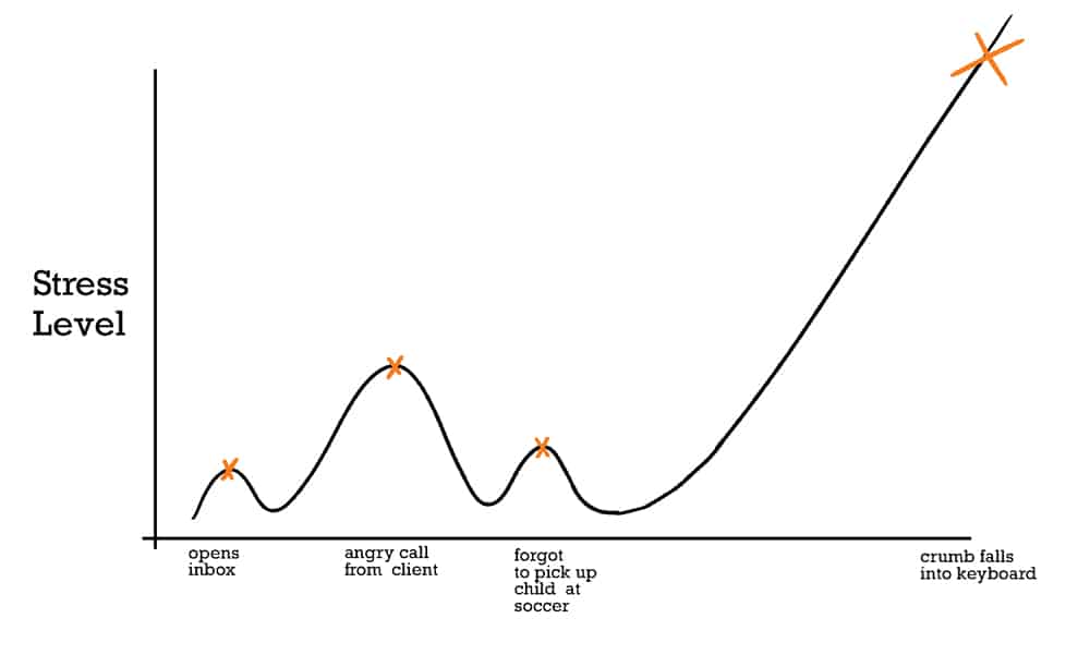
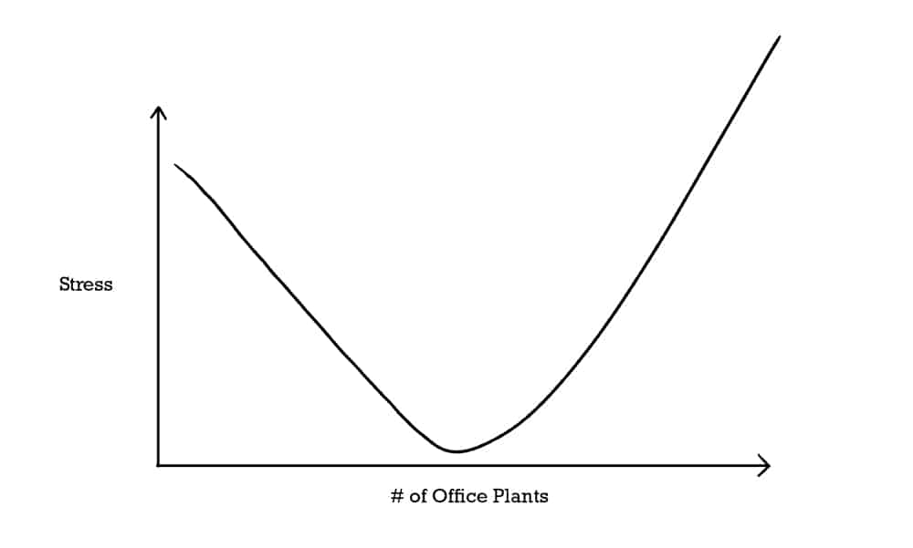
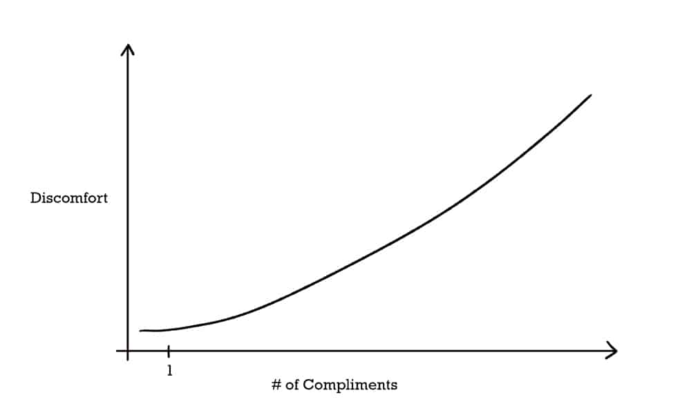
These infographics about work present such important observations as the fact that right now, you’re both (likely) supposed to be working and also looking at a Venn diagram, or that every employee ever has considered stealing toilet paper at one point or another. Another charts the trajectory of stress over time, noting correctly that a single breadcrumb is far more stressful than an angry client.
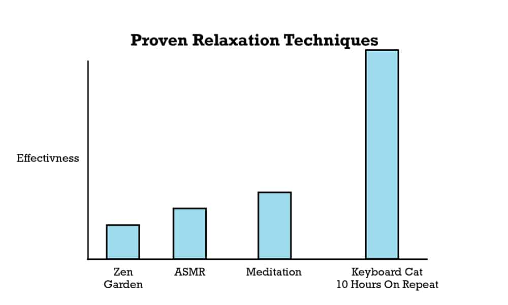
Some of the infographics about work present solid workplace-related advice through compelling visuals, such as the one that helpfully shows how Keyboard Cat for 10 hours on repeat is more than twice as effective for relaxation as ASMR.
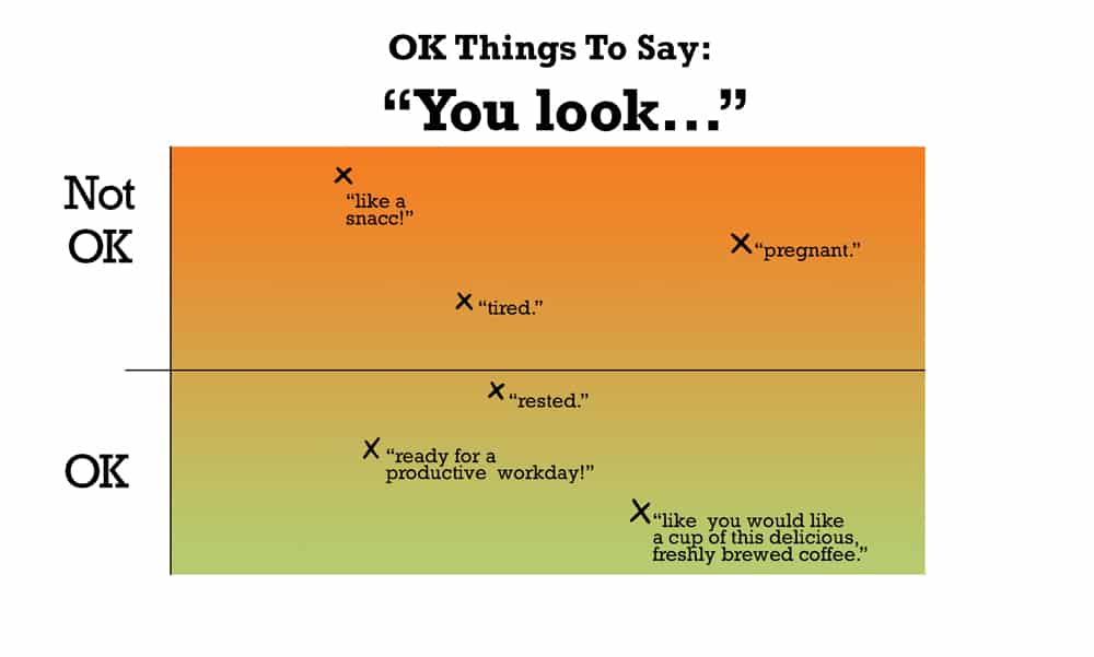
If you’re wondering at this point whether maybe you don’t disagree with some or most of the above infographics, that’s all right too. Infographics can package information in convincing ways, but their reach doesn’t extend that far. A key part of enjoying and consuming infographics about work or otherwise includes occasionally doubting them. For example, is it really not okay to say “You look like a snacc!” to someone at work? Well, in this instance, it’s probably fair to say that our infographic is unquestionably right. But asking those questions is the beginning of infographic literacy.
Read more: The Toggl Guide to Working from Home
Violet likes consistency, precision, and things organized neatly. She’s agnostic on the serial comma.