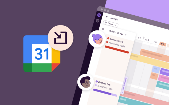
In the last quarter of 2021, we finally fully rolled out the new Task card, improved the navigation and overview on My Work view and made all your tasks accessible on our mobile app. Continue reading to get the full overview of our latest improvements.
The Product
Here’s what to look forward to the next time you open Toggl Plan.
A Simpler and More Flexible Task Card
After half a year of testing, feedback gathering and improvements, it’s finally fully here. The new Task card has quite a few perks:
- See your timeline while editing a task, getting more context around what else is happening.
- Switch seamlessly between tasks and start a new task creation in 1 click. Click+drag for a multi-day or hold option+click for a 1-day task.
- Always see every bit of information added to the task, never miss a detail. This includes comments left by your colleagues as the Task card now has a visible comment count, which doubles as a shortcut to the latest entry. And we’re saving unsent comments so if you get distracted, you can easily return to where you left off.
- The task card is more compact and fits more on the screen. It’s also flexible so you can remove what you don’t need. Oh, and there’s no need to add an attachments section. Just drag and drop your file over the task.
- Paste a link over text to conveniently add a hyperlink.
We also heard your feedback and made some improvements to the Task card. You can now
- click on the empty space on the timeline/board to close a task
- customize which sections and properties you wish to always see on your tasks
Simplified Navigation and Overviews for My Work
My Work was intended to help focus on what’s on your plate. However, we’ve learned it caused quite a bit of confusion regarding what information it was showing. To fix this error, we’ve switched to show the timeline only for the active time period and added navigation buttons to switch between timeframes.
We also heard that while many of you like the summary section, it can get in the way if there’s a lot of tasks on the timeline. So from now on, you can collapse it to the bottom of the page to just focus on the schedule.
Sign Up, See All Your Tasks and My Work on Mobile
Find our mobile app in Google Play or App Store.
Our mobile app has gone through quite a facelift last year. We finished 2021 strong with bringing Taskbox to mobile, meaning now all your tasks are visible also on the tiny device.
In addition to Taskbox, we also introduced My Work to our mobile apps so you can quickly check your schedule on the go. Additionally, there’s also the summary section to get an overview of your progress and Plans.
Lastly, you can now sign up to Toggl Plan from your mobile device. While user management and billing still have to happen in a browser, our colorful timelines are there for you wherever you go.
The Company
November was an especially great month for us as a team. For the first time in a long while, we got to have a face to face meetup. Despite the gloomy weather in Helsinki, Finland, we had a great time, trying out new experiences together and making memories. And yes, we also went all in with some good quality old-school workshops on post-its and whiteboards.
Want to join us next time? Good news, we’re hiring! Check out our jobs page here.
Final Words
I hope you’ve enjoyed another edition of our quarterly summaries. Make sure to give our mobile app a spin by downloading it from Google Play or App Store.
As always, let us know if you have any questions or reach out to provide feedback at support@plan.toggl.com.
Until next time!
Kati Kuustik is a marketing and analytics specialist at Toggl Plan, where she helps the product and marketing teams better understand user behavior in order to translate that into valuable product updates and effective campaigns.


